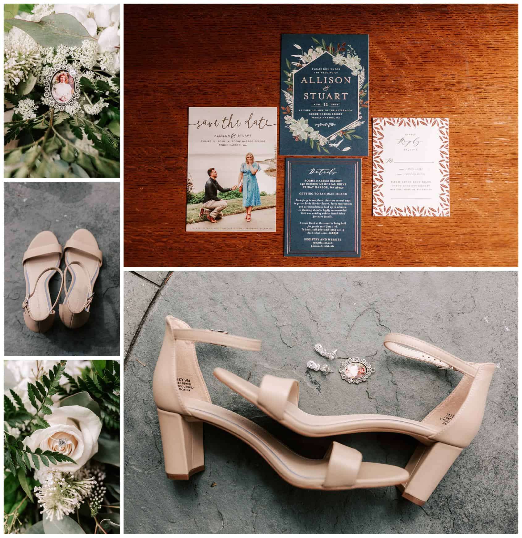
Designing your own wedding invitations can be a struggle, especially if you do it at home and you’re confused with the different styles to choose from. Fortunately, you can simplify this task by doing proper research and asking for tips from experts and experienced individuals.
If you want something that will be memorable, there are many options to consider. Depending on your needs or preferences, you may check out some online wedding invitations and other templates for inspiration and ideas.
Below are the other ways to design your own wedding invitation at home successfully.
Pick A Style
Invitation designs fall into particular style categories or, perhaps, borrow from several styles. Staying true to a specific style, particularly if you and your partner are having a themed wedding or prefer a specific genre or era, can be a great way to give your wedding invitation a strong focus.
Some of the design styles that work perfectly for wedding invitations include the following:
- Simple Retro – This style is borrowed from the 1950s, but its hip twist is what makes it different. That’s why it looks very ‘now’ and relevant. Vintage-inspired graphics, colors, and fonts bring information and a fun twist to this wedding invitation style.
- Art Deco – It’s an evergreen old-school style, but it gives off a stronger vintage vibe that can feel on-trend and hip. Art Deco wedding invitation styles offer symmetrical, lovely designs. This style also adds a glamorous edge with luxe colors, such as jet black, silver, and gold, and lavish geometric shapes. Depending on your preferences, you might like metallic foiling once you go for an Art Deco style.
- Elegant And Traditional – This wedding invitation style is timeless, classic, and appropriate for both informal and formal weddings. You won’t risk offending the wedding’s older members with this beautiful style. To achieve the look of traditional wedding invitations, you can combine dainty colors, script fonts, and floral borders.
Choosing a specific style is a great place to get started with your wedding invitations. Although you start out the traditional way and add a twist with a classic font, mixing the primary style genres will give your invitations a distinctive and recognizable character.
Consider The Cost
Even if you’re printing at home, the cost of paper and ink will still set you back a little, particularly if you choose heavily saturated inks or high-quality paper stock. So, make sure to factor in every detail, which may include the paper type, size of your invitation, whether it’ll be folded or flat, and some embellishments, like a wrap or a belly band.
You should also not forget about envelopes and postage. All of those elements will help you know if the cost savings outweigh ordering from professionals. Moreover, by knowing the costs, you’ll determine the other ways to save money from your wedding invitations.
Consider The Size And Shape Of The Card
You can stick to the standard size or experiment with modern shapes, like circle and square. Whatever it may be, you need to refrain from using a bulky shape because it can increase the cost of posting, and make it hard to manage or carry as you need to send out an invitation to a few people.
Consider Colors And Patterns
When designing your wedding invitations, you must also consider the patterns and colors. Ensure that they match with your font, and make sure that guests should be able to read the details printed in the card. Remember that experimentation shouldn’t intervene with the card’s legibility.
When choosing colors, take note that a light color against light and dark colors against a dark background can be dull to look at.
Choose Timeless Typefaces
Fonts can make or break your wedding invitation design. So, avoid novelty-type styles and pick typefaces that have lasting longevity.
Classics and timeless and elegant scripts always look occasion-appropriate. Unless you’re having a themed wedding, it might not be a good idea to experiment with a novelty font. Stay away from marker pen, grunge, and some distressed fonts that may look cool, but would make your design look too flyer-like and informal.
Search for typefaces that have different weights, too. You might like a font in a regular weight, but ensure that there are bold and italic weights available as well. Having venues and names in different weights could divide bulky text and make your design appear more balanced.
Choose Your Words Wisely
Learn the rules in wordings when it comes to wedding invitations. Traditionally, whoever’s hosting is listed first on the invitation. You must spell everything out, including the ceremony’s time.
On a classic wedding invitation, there’s a request line after the name of the host. The wording may change depending on the hosting situation, so don’t forget to double-check everything.
Use Imagery Or Photography
Photography is often under-used in wedding invitations. The designs tend to have an illustrative or typographic focus instead. If you want to give your invitation a unique and beautiful look, consider using photos on the layout. Such can make your invitations look fresh and modern. Images are also ideal if you didn’t choose a vintage style. To make your wedding invitations look contemporary, set the photos as a border or background.
When In Doubt, Keep It Classic
Classic wedding invitation designs are always in style and suit a range of personal tastes and events. Unless your wedding has a strong theme, the traditional design will work well. And, if beautifully designed, you’ll surely treasure it forever, and your guests will look forward to your wedding party.
Often, classy wedding invitations come with gorgeous script fonts with floral elements that work great for any type of wedding. When working on a classic design, try balancing masculine and feminine elements. Fuss-free, straight-line dividers and geometric borders give a classic design a masculine edge, while you can bring a feminine touch by incorporating scripted italics. You can also change to a darker background to achieve a glamorous look to a simple classic wedding invitation typeface.

Conclusion
It’s not easy designing your own wedding invitations at home. But, if you keep these helpful tips in mind throughout the design process, you can guarantee that you’re on your way to creating a wedding invitation that’s extra special and something that would dazzle and delight your guests.
